When it came to putting together Michael, the first posthumous album of material from late King of Pop Michael Jackson, everyone was working with half a playbook. The producers of the singer's first studio album since 2001 had to figure out what the notoriously detail-oriented Jackson would want them to do with the grab bag of songs he was working on at the time of his death.
Even the artist behind the album's iconic cover, a Renaissance-painting-like mash-up of iconic images from throughout Jackson's career, was forced to go on his understanding of what Michael would have approved of.
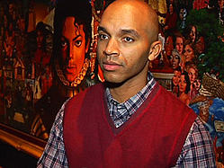
That artist, Kadir Nelson, sat down with MTV News last week to walk us through the thicket of images on the cover and explain how he came to create the visual summary of the pop icon's solo career.
Nelson said the ball started rolling in 2003, when Michael was working on songs for his Number Ones collection at Marvin's Room, the legendary Los Angeles recording studio founded by R&B great Marvin Gaye in 1975. Jackson saw a pair of paintings Nelson had made chronicling Gaye's life and fell in love with the images.
"As a result of seeing it, he called me one afternoon and he said, 'I really like your Marvin Gaye painting ... I want one, about me ... but I want it bigger.' Because Michael liked things to be big," Nelson said. But, as with so many projects begun by Jackson, after Nelson followed the singer's advice and read the autobiography "Moonwalker" and did some research on the painting that was to hang in Michael's home, other things came up and the project fell through the cracks.
Then, following Jackson's death in June 2009, his longtime friend and now estate co-executor John McClain rang Nelson up and said the gig was back on. "[He said], 'It's time for you to do that painting that Michael wanted you to do,' " Nelson recalled. " 'Don't ask any questions, just do the painting and we'll figure out what to do with it later.' "
The resulting image plays into Jackson's lifelong belief that bigger is better, with a regal Michael staring out in the central image while wearing a prince's Victorian blouse with a high, ruffled collar, a silver-gloved hand placed over his heart and a jewel-encrusted crown hovering over his head. Around that central image are painted nods to everything from such classic videos as "Beat It" and "Thriller" and a spaceship from one of his favorite movies, "E.T." and MTV's Moonman, a reference to the fact that Jackson's videos helped make the channel the force it is today.
The sadness of Jackson's death made Nelson a bit hesitant at first, but he said he realized he was getting a rare second chance to follow through on the abandoned project, so he was quick to say yes. "I did it because I felt that it would be a very important document ... and a tribute to Michael's life," he said of the finished work, titled "The King of Pop."
He described it as a "panoramic celebration of Michael's life, music and career" and said he strode to make it as perfect as possible to match the level of perfection Jackson insisted on in his music and art. "I felt that I owed it to him, to his family, to his fans, to do the best job possible."
Though Nelson only spoke to Jackson that one time in 2003 over the phone, he worked with the singer's brother, Jackie Jackson, on the image over a five month period at the studio where the Michael album was being completed and said that Jackie gave some insight into his sibling's thoughts. When the final image was produced, MJ's brothers Jackie and Marlon Jackson and McClain gave it a thumbs-up and said he did a good job.
Like the video for the first single, the Mark Pellington-directed "Hold My Hand," it's an artistic leap that attempts to tap into Jackson's elusive magic, but Nelson feels like he succeeded.
He considers the final product — his biggest-ever canvas at more than 9 feet wide by 4.5 feet tall — his Sistine Chapel. And like Michelangelo's signature work, Nelson labored long and hard on the painting, putting hours in from August 2009 until January 2010 and then again on and off until October.
What do you think of the finished product? Share your reviews in the comments!


